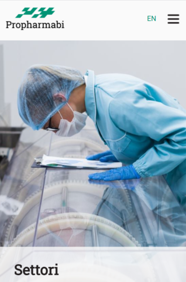
Those working in science communication are not always aware of the extensive, often invisible work that underpins innovation and scientific research. This includes the contribution of companies like Propharmabi, which design and build clean rooms, laboratories, and production facilities for sectors that depend on controlled environments, such as chemistry, aerospace, and electronics.
Through the redesign of the logo and website, our goal was to bring this expertise to the forefront and give visibility to the know-how and thirty years of experience of a company that stands out as a small Italian excellence in the design and construction of facilities for innovation.
Through the redesign of the logo and website, our goal was to bring this expertise to the forefront and give visibility to the know-how and thirty years of experience of a company that stands out as a small Italian excellence in the design and construction of facilities for innovation.

As is our standard practice, the project began with an introductory workshop aimed at developing a clear and shared understanding of the brand’s identity, strengths, limitations, and the client’s expectations. We also conducted an analysis of competitors’ websites and SEO positioning.
The logo was subtly restyled to preserve the emotional connection with the brand’s history. We introduced a more contemporary typeface and recovered the vector version of the logo, which had been lost over time.
The website was designed as a showcase site, with a clear structure and a restrained visual language. To support SEO performance, we introduced a dedicated FAQ section addressing key industry topics.
Ensuring technical accuracy was a central concern. We reviewed regulatory frameworks and technical documentation for each sector, allowing us to produce content that is scientifically sound yet accessible. The result is a narrative that communicates Propharmabi’s authority while maintaining clarity and readability.
Through this work, we gave a digital voice and presence to a company whose expertise quietly enables scientific progress.